 Of course color matters! But I’m not talking about polarizing protest slogans. I’m talking about color and design.
Back in the day, designing in color was simpler – from 1905 to 1935 Crayola only gave us eight (8) colors. Now just look at all the choices in your crayon box. Lawrence Herbert saw how difficult it was for designers to communicate the language of color, so he bought the printing company, Pantone, and set things in motion to change that. Even Pantone started with just 10 colors in the early 60’s, but today has just short of 1,900 colors defined. X-Rite bought Pantone in 2007 for $180 million, so I’m safe to say that color is important!
Dorothy opened her eyes and followed a Yellow Brick Road to arrive at the Emerald City, then clicked her Ruby Red slippers to go home. Color can be used to create a sense of urgency, move us along in a direction, and provide us with information.
Unless we were to be plunged into darkness, for roughly 90% of us, everything around us is in color. Color has everything to do with light and how our brains and eyes process and perceive this light. Without light we would not be able to even see colors. Yet for about 10% of us, mostly male and mostly for red-green colors, who don’t see color the same way as the majority – color is difficult and confusing.
For everywhere, EXCEPT for Tipperary Hill, NY, traffic lights were eventually standardized to have red on top and green on bottom – which is a good thing for everyone including the colorblind driver. The design meant far fewer accidents.
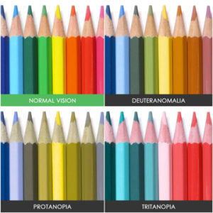
The image to the left (above), shows how colors appear to those with normal vision vs the three most predominant color blind types. Of course, only the normal sighted will ‘get’ the distinction, and thus we begin to head down the rabbit hole.
I worked with an artist friend who is colorblind just as computers were coming out of two shades of green or black and white into 256 colors and then to 16 million. As long as he had his (labeled) crayons, pens and markers, he could turn out amazing pieces of art for the normal sighted. Confronted with little randomly positioned squares of color or an unlabeled color wheel on the monitor, we’d sometimes get a cacophony of color in his illustrations.
A great many components go into designing a website to be accessible to the largest possible audience – regardless of if they’re right-brained or left-brained, on a desktop or smartphone, physically or color challenged. So what are some hints for designing a website for better color accessibility?
- Use Color AND Symbols
- Don’t rely on color alone to convey a message
- Keep it Minimal
- Limit the color palette you use for your website
- Use Patterns and Textures for Contrast
- Use different textures, as opposed to multiple colors, for elements that require emphasis
- Be Careful with Colors and Hues
- Use a range of clearly contrasting colors and hues in your design
- Avoid Bad Color Combinations
- Green & Red
- Green & Brown
- Blue & Purple
- Green & Blue
- Light Green & Yellow
- Blue & Grey
- Green & Grey
- Green & Black
